Now we have looked at possible names and initial ideas for our production companies we can design 3 in detail and include images of how we want them to look. After considering our 4 initial ideas we have decided to further develop 'Treehouse Pictures', 'Splish Splash Pictures' and 'Empire Productions'. We felt that Treehouse Pictures would be more effective than Lighthouse Pictures also, the lighthouse idea has already been created by an existing institution.
Treehouse Pictures: For this logo the screen would start off as black, the door would begin to open - as this happens the camera quickly zooms out to reveal the whole tree and the title.
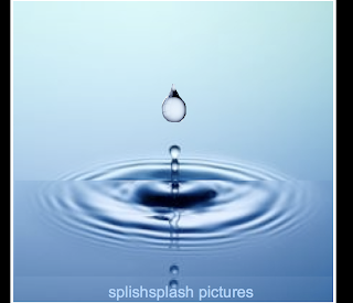
Splish Splash Pictures: Starts off as water on the screen, then a single raindrop falls and after a short time the title appears.
Empire Productions: The camera starts off at a low angle of the building and quickly pans up the building (zoomed in), as this happens each window lights up in turn. When the camera reaches the top of the building the title is revealed and shines.
After considering all three of our ideas, we have decided to use 'Empire Productions' as our main institution and 'Treehouse Pictures' as our supporting institution. We feel that these are more effective and look most professional of the three. We are using 'Empire Productions' as our main institution as this has the most animation and looks the most like a mainstream production logo.
Cath, Charley, Joanna


No comments:
Post a Comment